Branding
Blue Ocean
Grow Your Business
Blue Ocean implements customized Salesforce marketing solutions for businesses and offers support services. The challenge was to develop a unique identity that reflected the personalized and friendly expertise of this CRM (customer relationship management) systems integrator.
Nestled within a competitive sector the new logo needed to elevate the brand, come off as approachable and stand out from its peers.
Logo Ideation
The process began with stakeholder discussions to establish positioning and assign attributes that best described what the company needed in an identity.

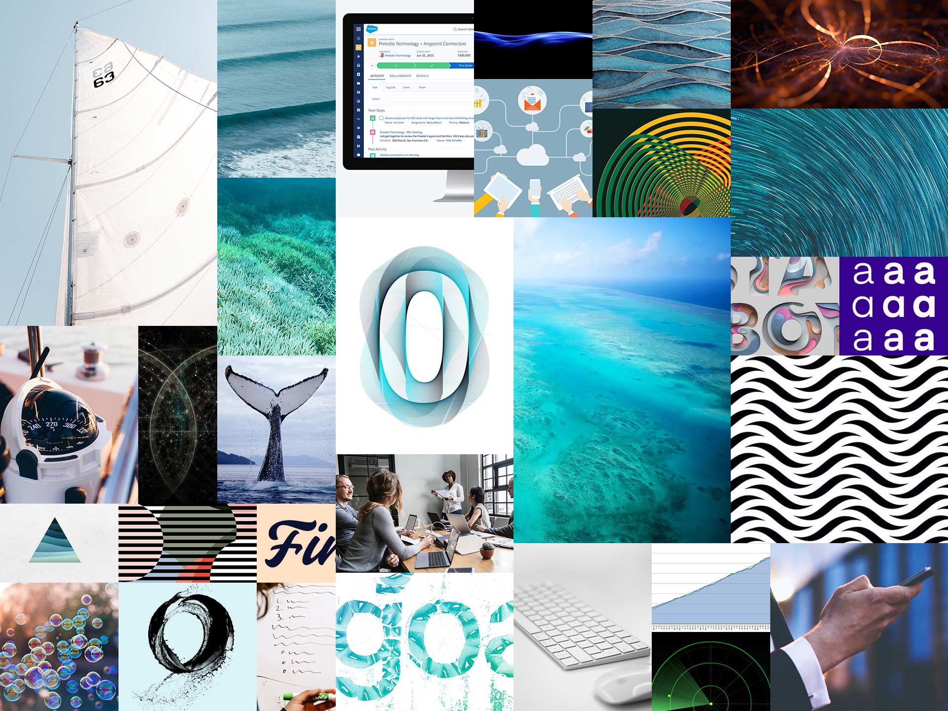
The next step was creating a mood board to explore shapes, colors, font treatments and other visual parameters. This ensured client and I were on the same page in regards to direction and brand personality.
Sketches were essential to help visualize ideas, explore shapes and experiment with logotypes. Anything was fair game at this stage, as long as it stayed true to the brand positioning and mood board.
The direction was then narrowed down to a logotype that visually represented 'ocean' and key brand attributes. The forms and wave pattern create a fresh design that is unique, streamlined and welcoming.
Variations were illustrated in more detail to allow for better analysis and for determining the best options.
It was important the typeface be bold and simple to accommodate the negative space, while having personality to reinforce the design concept. It needed to look modern, friendly, professional and be versatile in order to scale down without losing legibility.
Researching multiple options I looked for one that ticked all the boxes and stood out from its peers.
Construction and Finalizing the Logo
Once final concept was determined it was meticulously built and measured for accuracy.
The streamlined ripple that shapes the negative space is formed from repeating circles that are proportioned—according to the Golden Ratio—and centered as a unit to the typefaces second letter "e". This creates symmetrical curves that naturally flow off the word "Blue".
A cool blue was selected for the main brand colour. The hue is friendly, welcoming and identifies itself clearly in the CRM category. It avoids visual confusion other hues present and uses sub-tones to allow for greater flexibility.
Effra Bold was selected for the logotype as it delivered a unique contemporary look, that could be applied clearly on a wide range of media.
Hex #00A0DF
R 0, G 160, B 233
C 74, M 21, Y 0, K 0
Pantone 299 C

Effra Bold

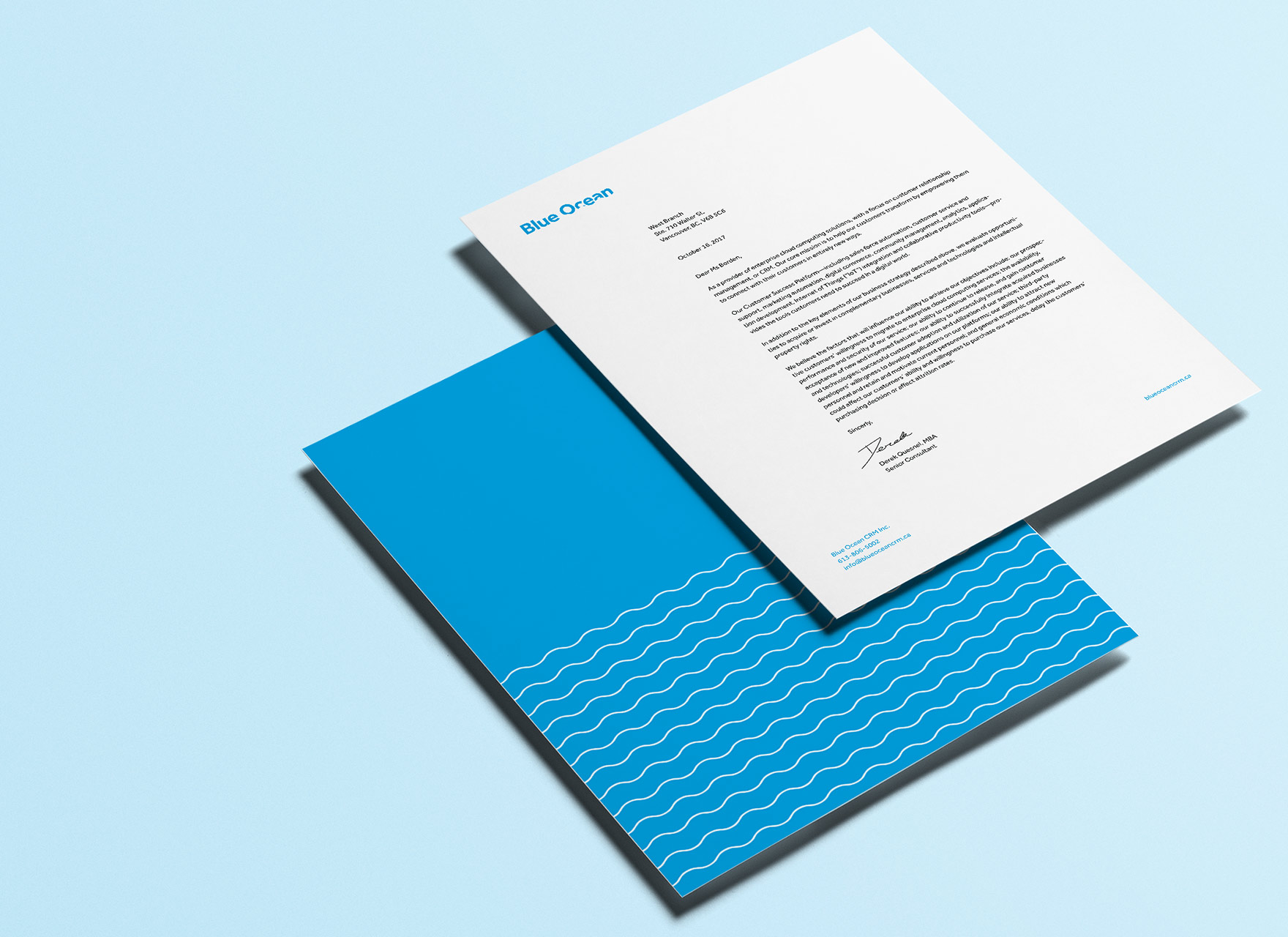
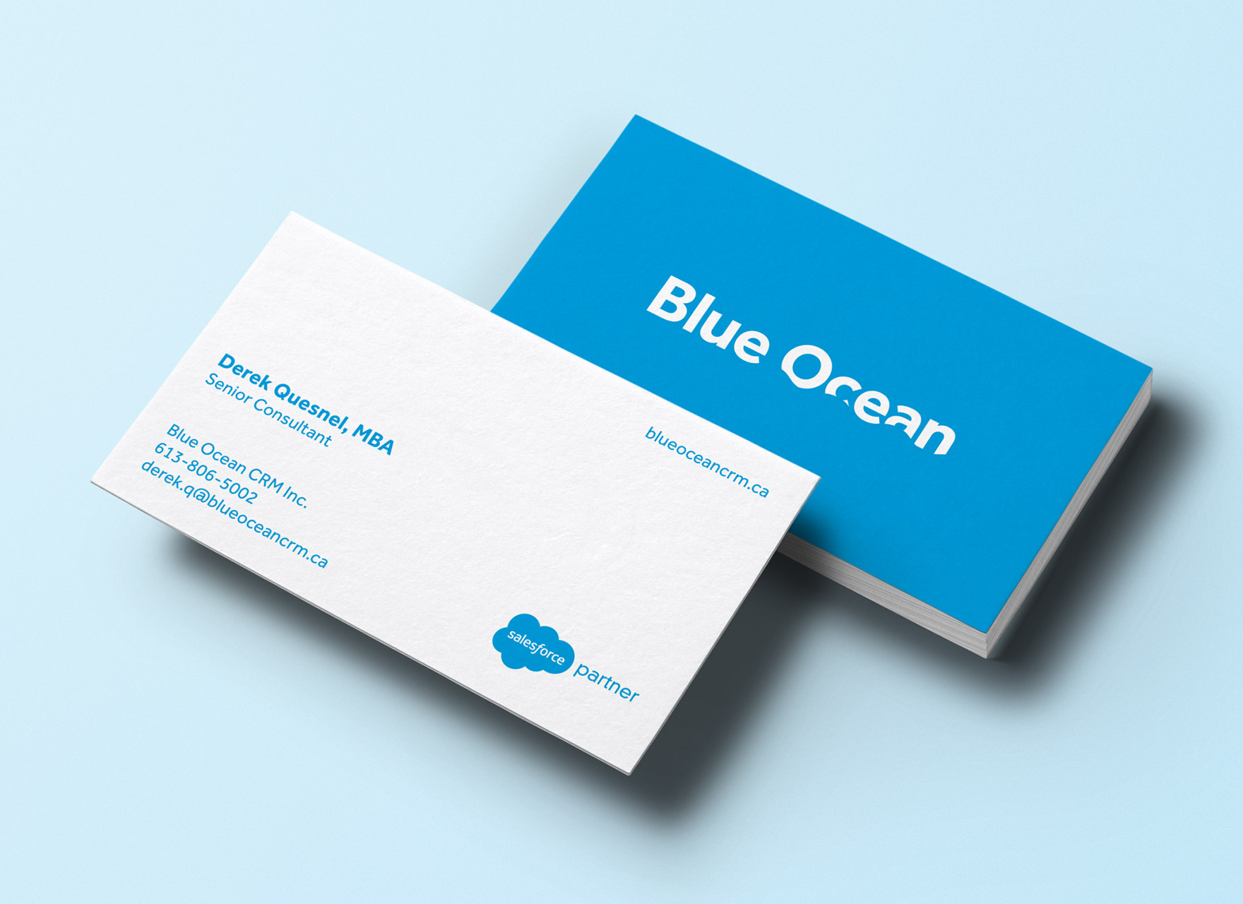
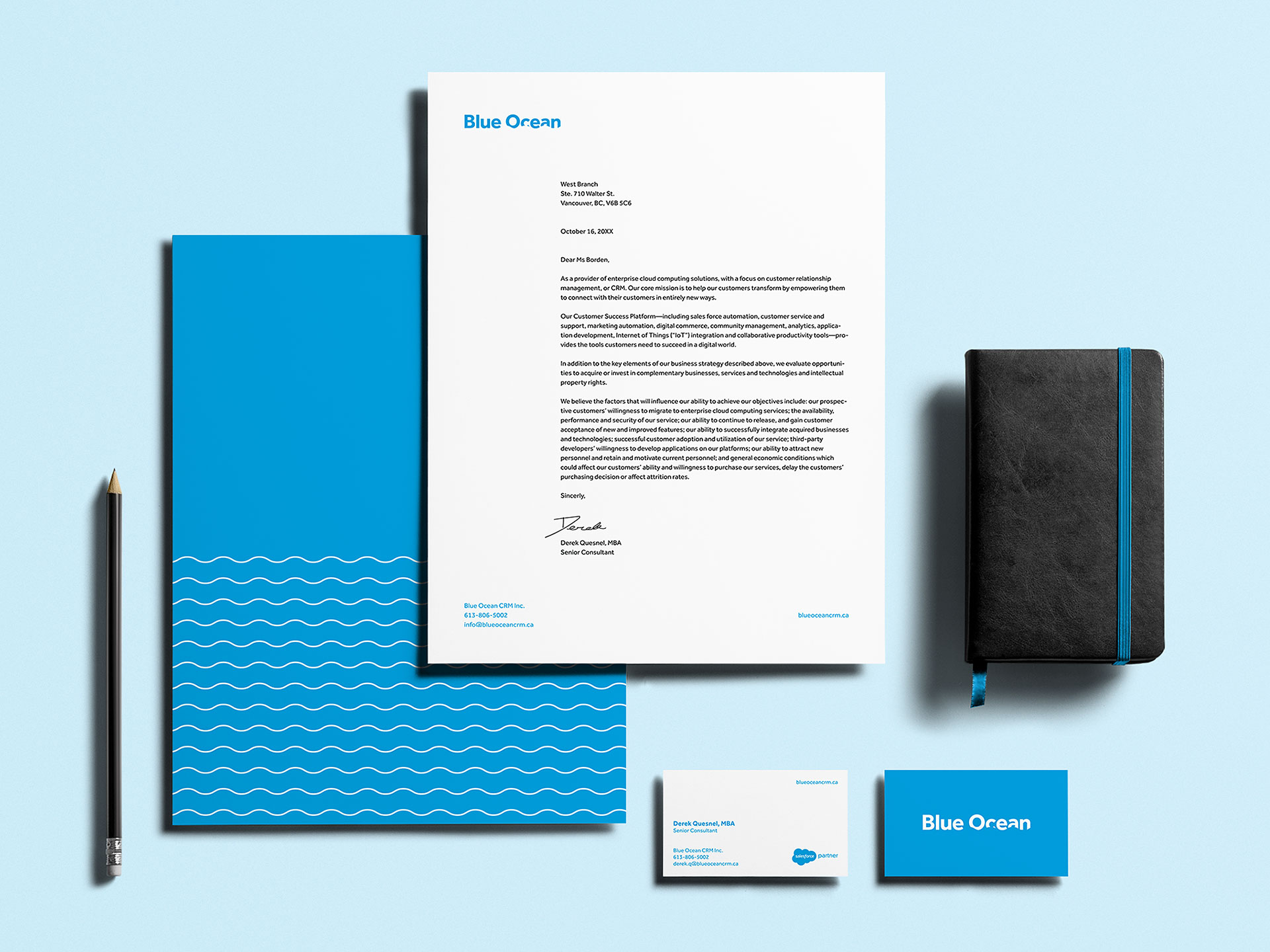
The stationery was designed to keep an open aesthetic that complements the logo design and incorporates brand pattern when needed. Elements are aligned and balanced to provide a clean finish.