Website Design
Migrants & Refugees Section
Improving responses to the displaced
The Migrants and Refugees Section needed a website to bring attention to and focus efforts on the needs of the forcibly displaced—not only in major conflict zones, but all over the world.
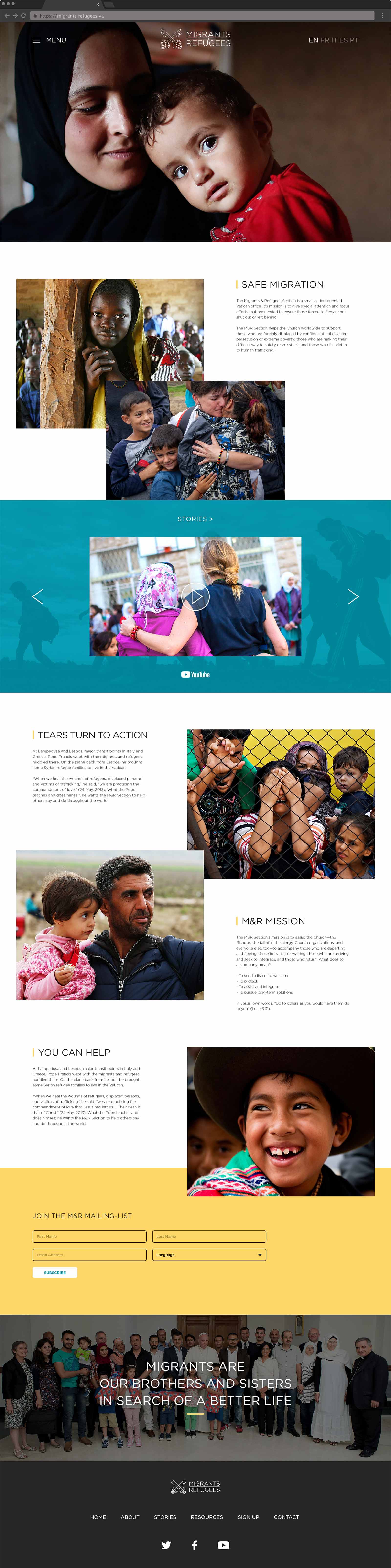
The new website was designed to highlight the work of the Section and present news stories and resources in an informative way. The goals were to make the content easily accessible, inspire users to learn more about the issues and encourage involvement at the local level.
After researching other organizations our approach was to keep page layouts understated, while placing the emphasis on imagery and videos.
The home page guides users through an image rich overview of the Section, with photos optimized for responsive scaling and extremely quick load times. A slider features the latest stories and resources, providing users the most relevant, up-to-date information all in one place. This creates a one-click process, bypassing the additional option of navigating through the menu. In order to effectively encourage newsletter subscriptions the bright segment uses the only direct CTA on the page. This minimal approach goes straight to the point and avoids any visual distractions.
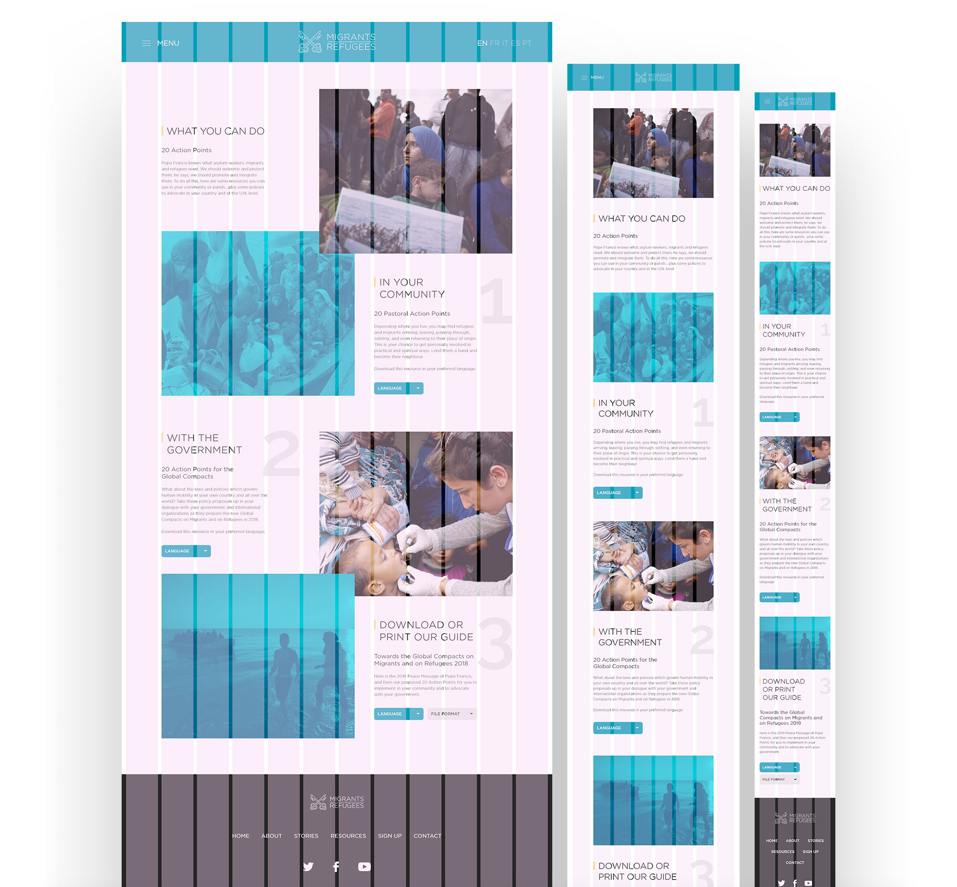
The multi-platform website was launched in five languages. Therefore, it was important to create page designs that could accommodate translated texts on all screen sizes.
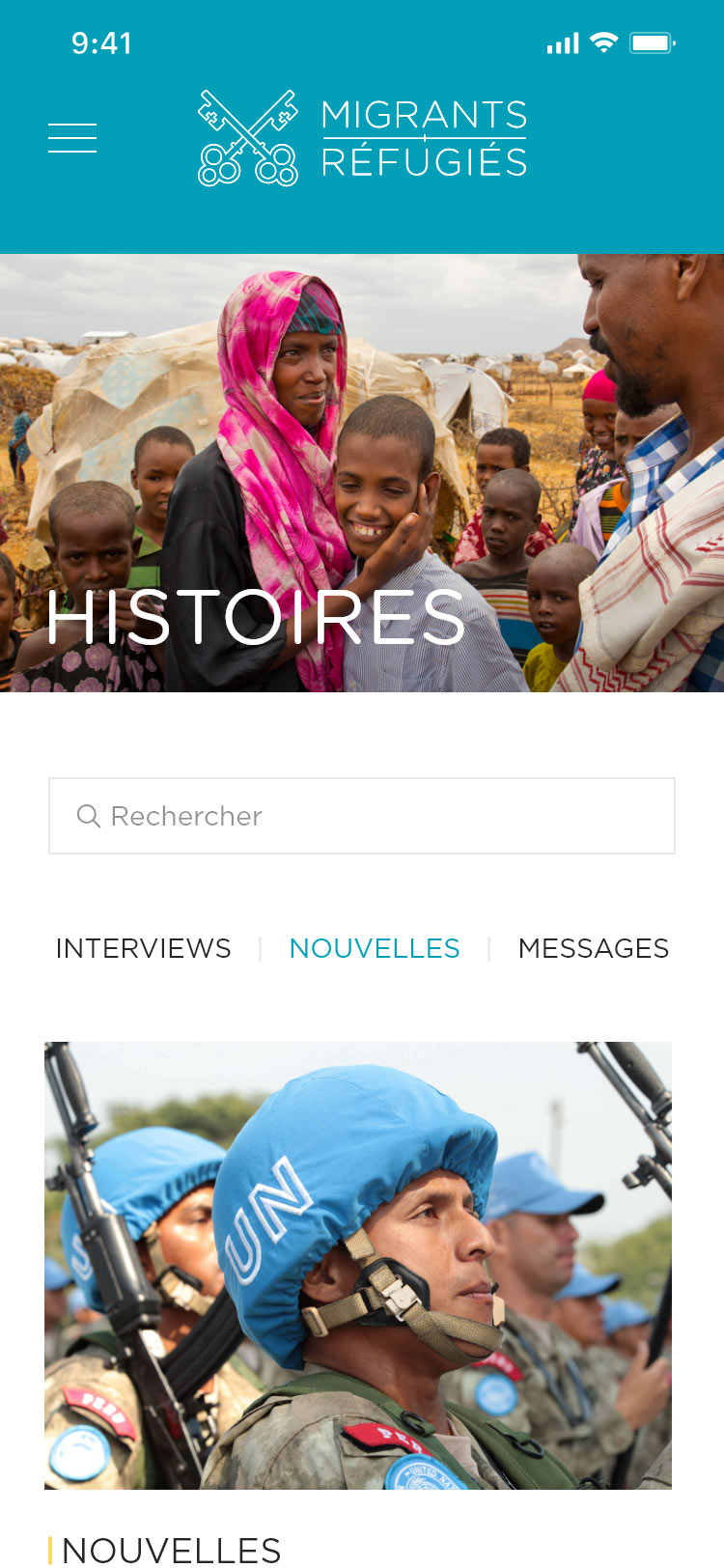
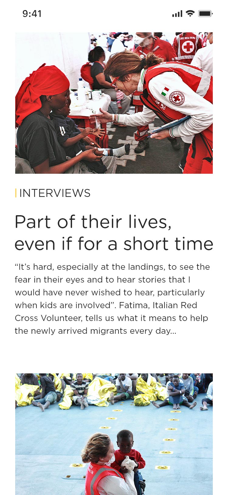
Below left/centre: The Stories page uses a newsfeed style design that allows users to filter content easily. As more content came online additional filters were added.
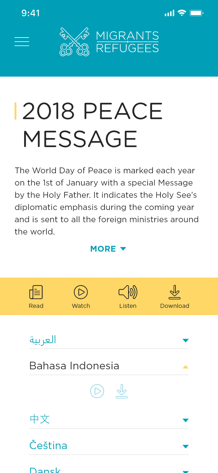
Some resources were provided in more than five languages to accommodate additional multicultural communities. In these cases accordion tabs, icons (above right) and buttons (below) were used to categorize the multimedia content for each language.
It was also important for resource pages to be visually organized and downloadable content clearly defined. Several iterations were tested based on user feedback before final designs were implemented.
Responsive design
Although the website content was built with mobile first in mind, web page mockups were designed simultaneously for desktop, tablet and mobile.
Layout grids with standard 12, 8 and 4 column breakpoints were used to align content and set padding.
Typography and header styles were established for each viewport as part of the style guide. Separating the three made it easier to keep track of size calculations between headings and their respective body copy.

Brainstorming
Once the sitemap was approved a flow chart was created in order to illustrate how users would access the news stories and also be prompted to subscribe. These functions were given priority at the request of stakeholders.

Although resources were equally important I knew most of that content would come online over time. Therefore the approach was to first determine an MVP and break up the website rollout into phases.
Wireframes were designed to make sure there was flexibility in the layouts to accommodate the additional content and filters. It was important to work out those challenges at this stage before proceeding to mock ups.
Phase 1

Phase 2

#009FB7
#FED766
#262626
Conclusion
Coupled with a social media push the launch of the website was a success. There was positive feedback from users, and numbers for web traffic and subscribers was promising. Despite some early challenges with resource layouts the site's flexible design has allowed it to evolve seamlessly as more content comes online.