UI/UX
Switchboard
Where social audio meets sound technology
Switchboard is a voice communication and messaging app that allows users to connect, listen to music together and instantly talk as if they were in the same room.
As part of its evolution, a refresh was needed in order to make the product more intuitive and improve design consistency. The challenge was redesigning the interface to reduce user friction, while making it easier for them to communicate and access features.
Careful attention was paid to make sure the refreshed design felt quick and uncluttered, in order to provide a smooth and enhanced user experience.
By consolidating most actions to the chats screen and using established UI patterns, additional gestures were eliminated. Previous app iterations needed multiple taps to go to a user's profile, the music player, or select conversation features like voice messaging, talk and text. Now users could tap once or swipe to access the same features without needing to go into settings or the specific conversation screen.
Without the need for tabs the lower space was designated for the audio player as in all previous versions. The new icon design however is visible by default, with a 'hide' option in settings. This encourages users to connect to the music player, and friends to engage and listen in sync.
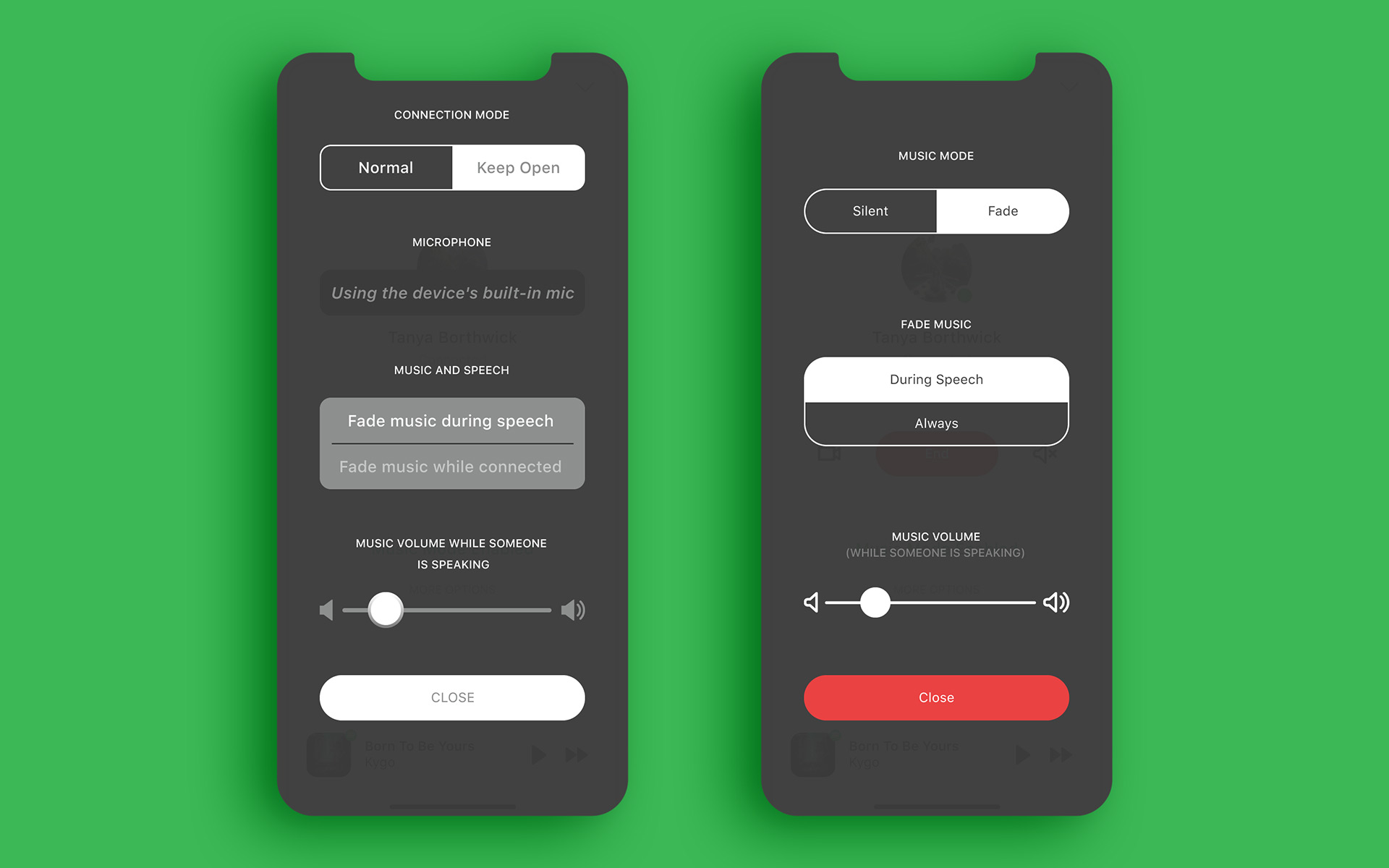
Talking to friends is not impaired while listening to music. The voice detection feature automatically dims or shuts off music depending on the settings. Earlier versions of these talk screen settings (left) created pain points for users as the terminology was somewhat confusing. The redesigned controls (right) are simplified, visually less intimidating and make it evident what the feature options do.
Research methods
The first steps were to identify the user pain points, analyze what was working and what needed to be revamped. Based on user feedback collected by the product manager and stakeholder discussions, the team defined several areas for improving usability and minimizing cognitive load:
- Make onboarding and settings (like voice controls) more concise and straightforward.
- Reduce gestures needed to complete objectives.
- Improve visibility of the music player feature.
- Design a simplified and more recognizable interface.
The goal was to have a redesign that would incorporate these improvements, without creating additional friction for users, who had become accustomed to the existing interface and flow.
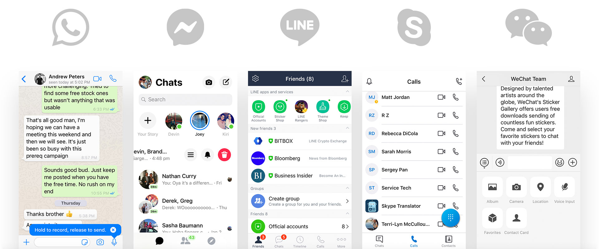
Once needs were defined research was conducted on competitors in the messaging and communication space. The focus was on their implementation of both common patterns and unique features, as well as layout structures that would help guide my design decisions.
Several key findings that stood out were features accessible through swipe gestures, solutions to managing groups and contact integration.
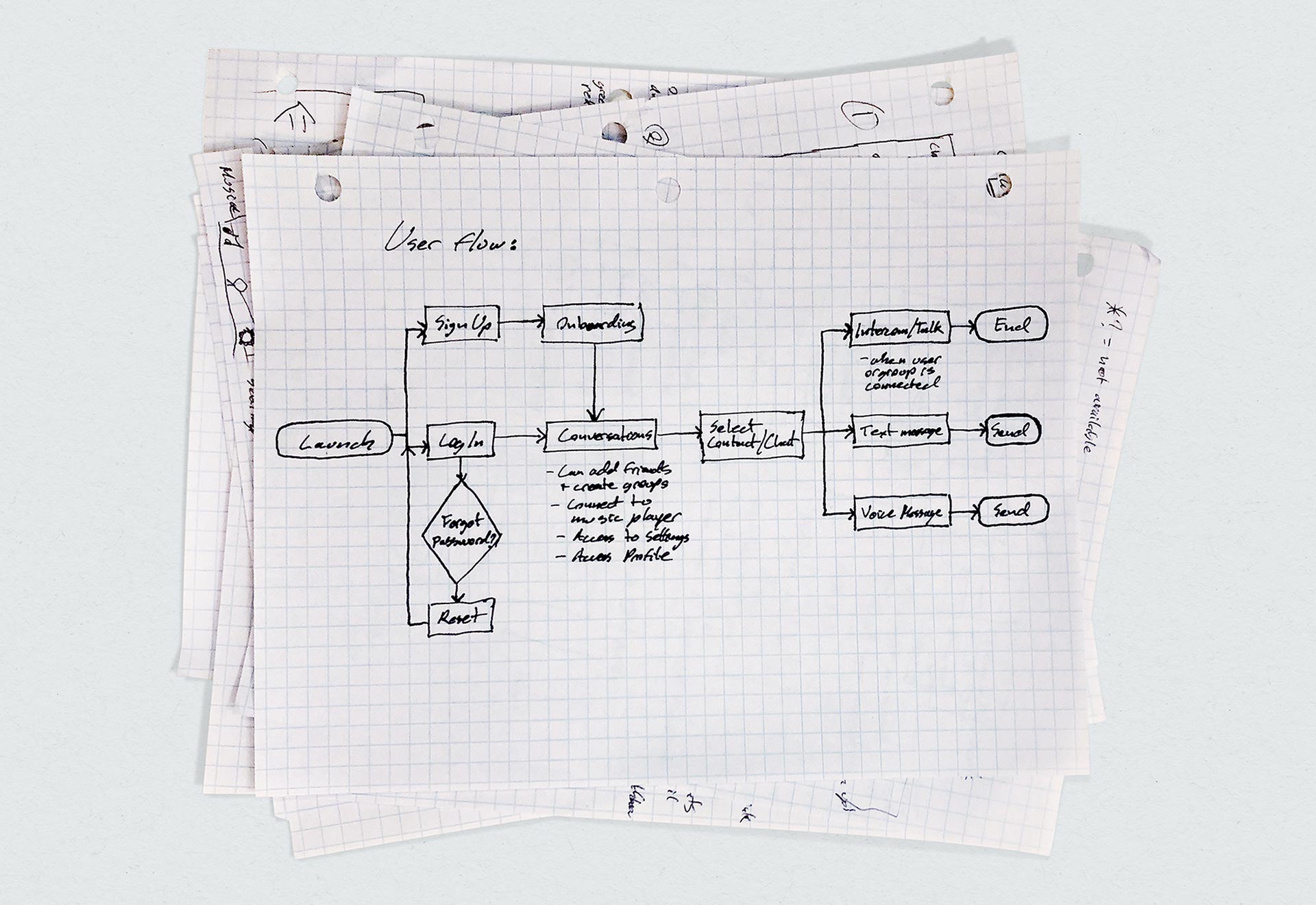
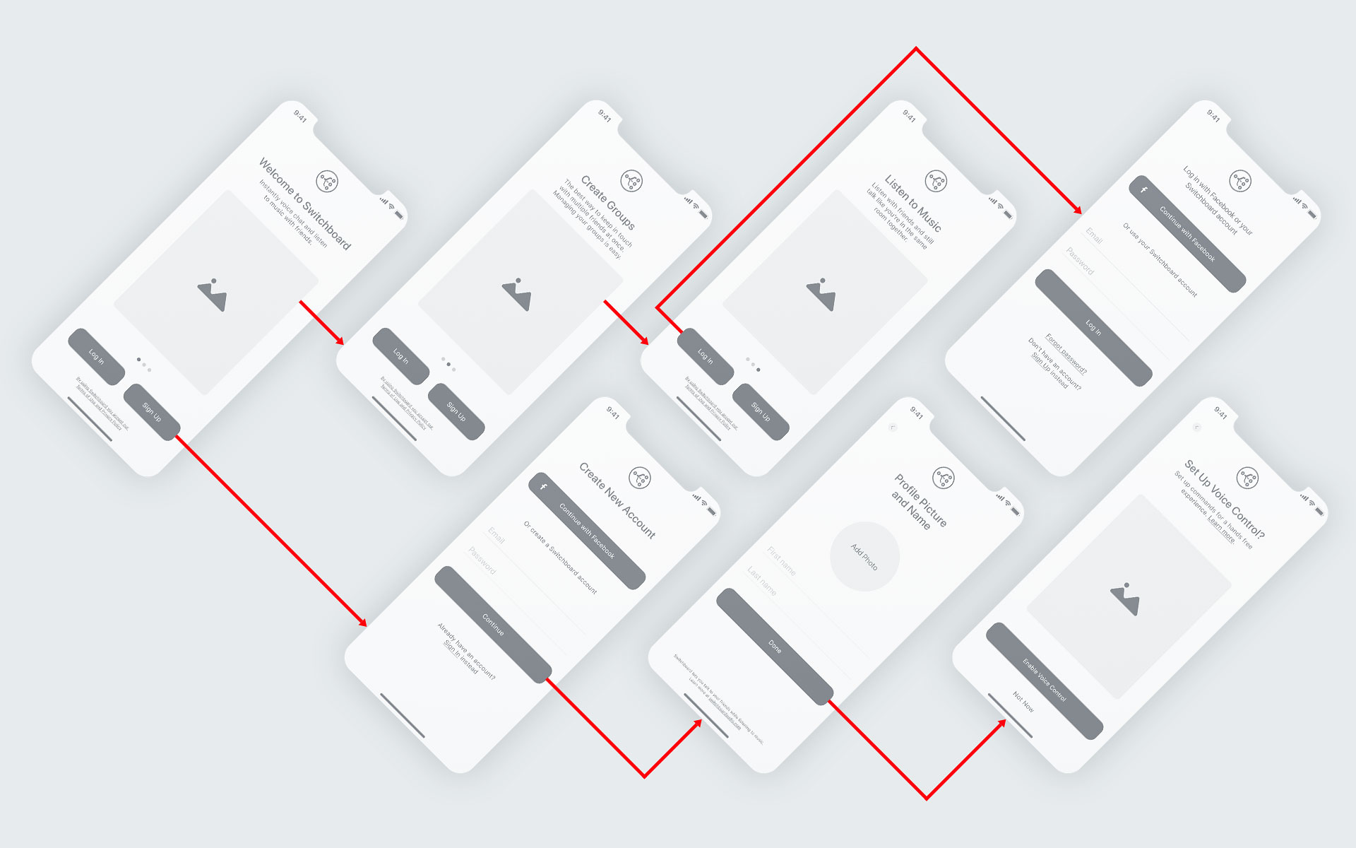
Sketches and low fidelity mockups
Sketches were done to brainstorm layout options, ideas and flow. It was important to map out specific wireframes in order to make quick adjustments based on team feedback, and check what worked within existing visual hierarchy.
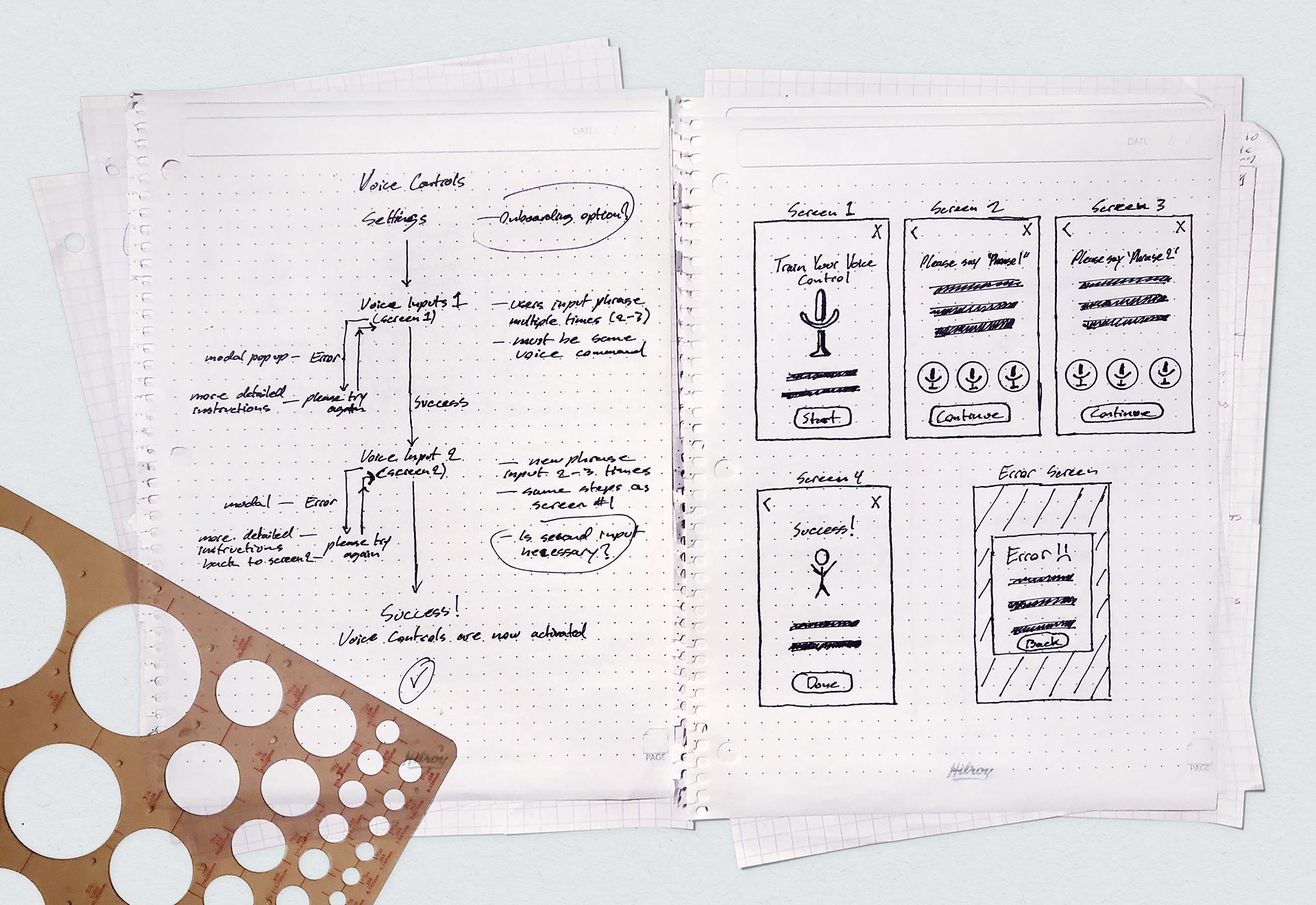
Once wireframes were approved, low fidelity mockups of several features—such as onboarding—were designed. Prototypes were sent to the dev team for review and testing, before final work on the user interface began.
Style Guide and Icons
The Switchboard color palette remained on brand without any adjustments. iOS system fonts were used along with Apple's suggested variants and tracking.


I created custom icons to enhance the interface and improve design consistency. The new icons are styled to complement the Switchboard logo and product aesthetic. Careful attention was paid to make sure these were scalable and pixel perfect.
Conclusion
To date some elements of the new user interface have been implemented, while other features and improvements will be rolled out in future updates. Metrics are encouraging as user acquisition and engagement continue to grow.